Using a User Segments Quadrant to Build Journeys
How a simple visualization can make it easier to ideate user journeys in your product.

At Finiac, we were recently struggling to understand how to design for different segments of users effectively. Our product serves individual investors - that is, people with money in the stock market. Inside that group is a wide array of different segments of users - from completely passive investors to highly active day traders.
We’ve done a lot of user research, and have learned a ton about how different folks approach their investing. We’ve always thought about our users as existing on a gradient - a smooth transition from people who are passively engaged to those who are actively engaged, but that didn’t seem rich enough to effectively drive product decisions. So, we asked: what was driving their engagement, or at least, what was related to it in a way that might help us better understand different segments?
We landed on knowledge level, giving us two axes: their knowledge level, and their typical engagement patterns. For knowledge level, we went with a simple beginner <> advanced scale, and in terms of engagement, we went with disengaged <> engaged, with respect to how much the user tends to be involved in their portfolio design-making.
That left us with a quadrant:
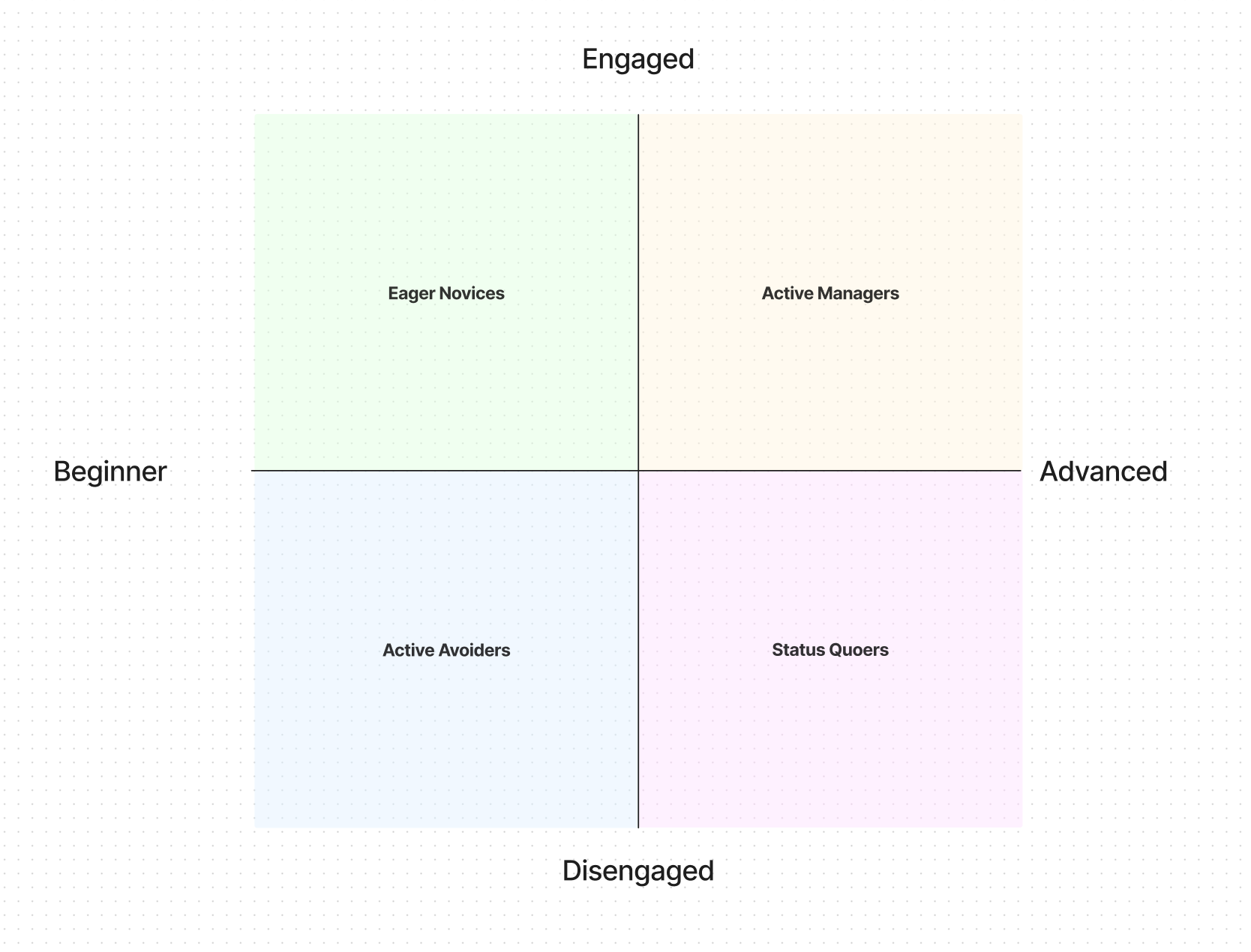
Inside of each of the quadrants, we named this group of users. Starting from the bottom right, moving clockwise:
Status Quoers: these are people who have a decent level of knowledge about investing, but are disengaged from the day-to-day management of it. In our research, we noticed this trend: a group of people who had a reasonable level of knowledge about investing, but preferred to let an advisor or someone else handle everything for them. One way to describe these folks might be “jaded”. While they have the ability to manage their own investments, they believe there’s not much point. These people tended to be older (tho, not exclusively), and generally disinterested in investing products in general. These folks are not our users.
Active Avoiders: the Active Avoiders are similar to the Status Quoers, but with a notable nuance: because they have less knowledge, and less experience, their disengagement isn’t because of a jaded view of the markets, it’s because they’re intimidated by it. These individuals also tend to delegate things to others, like advisors, but not because of a feeling of helplessness, but because dealing with it personally feels overwhelming, and people generally avoid things that are overwhelming. When we spoke to these people, they showed an interest in increasing their level of independence, weren’t sure where to start.
Eager Novices: Eager Novices are Active Avoiders that have gotten over the intimidation hump. These folks tend to seek out knowledge and are in the process of starting to learn, and also show a much higher degree of involvement in their portfolio construction and maintenance.
This is a transitory state: eager novices, because of their engagement, often increase their education level at a relatively quick pace, moving them to the final quadrant: Active Managers. Some of this group also tends to fall back into the Active Avoiders camp, as they get intimidating while learning, and the overwhelm pushes them back into a state of avoidance.
Active Managers: this group is our ideal users. They have an intermediate to advanced level of knowledge, and wield that knowledge in practice, but managing their portfolios themselves on an ongoing basis. This group uses spreadsheets and other tools to aid in this.
Adding Motion
Now that we had this quadrant, we could immediately start using it to make decisions:
For this screen we’re designing, how would each of these groups interpret it?
How might we stage features and use progressive disclosure to reveal advanced tools for Active Managers, while keeping the core UI basic enough for the Eager Novices?
These are great questions, and really help us to think through how someone experiences the product, in a way that helps us make some really clear decisions on how to design the thing.
But there was still something missing. Our mission at Finiac is to help people become more confident managing their own investments, to give people a greater sense of control, and the calm and peace of mind that comes with that. Not to mention, the financial rewards that come from being engaged with your investing.
If we’re going to succeed in that mission, then we have to get more people into the Active Manager camp.
So, we started thinking about movement around the quadrant:
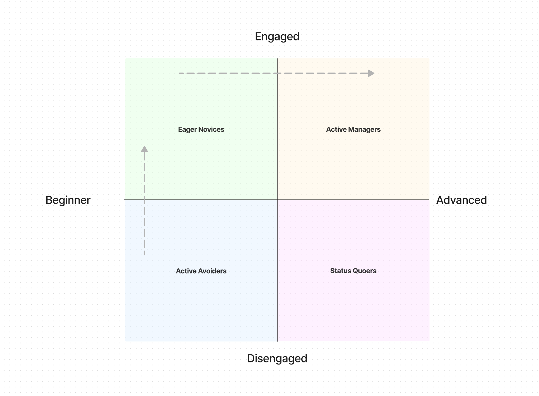
After a discussion about these user groups, we landed on the above. These two arrows show movement from one quadrant to the other: Active Avoiders turn into Eager Novices, which in turn graduate to Active Managers.
Effectively, a maturity model for individual investors.
Asking Better Questions
Adding movement into the picture increased the fidelity of the questions by an order of magnitude. Now, instead of just asking “What does an Eager Novice need on this screen vs. an Active Manager?”, we could ask, “How might we move someone around the quadrant, effectively increasing their engagement, and turning them into both better users for us, and increasing their own personal outcomes?”
That’s a much more interesting question, and one that starts to chip away at the service design of the product. All the sudden, ideas like tiered education, and unlocking additional advanced features through repeated use get really interesting: they’re ways in which you facilitate the movement from one quadrant to another, increasing both user, and enterprise value along the way.
Aligning With User Research
A final step we took, to make this even more effective as a design tool, was to lay some of our users from our research onto the quadrant:
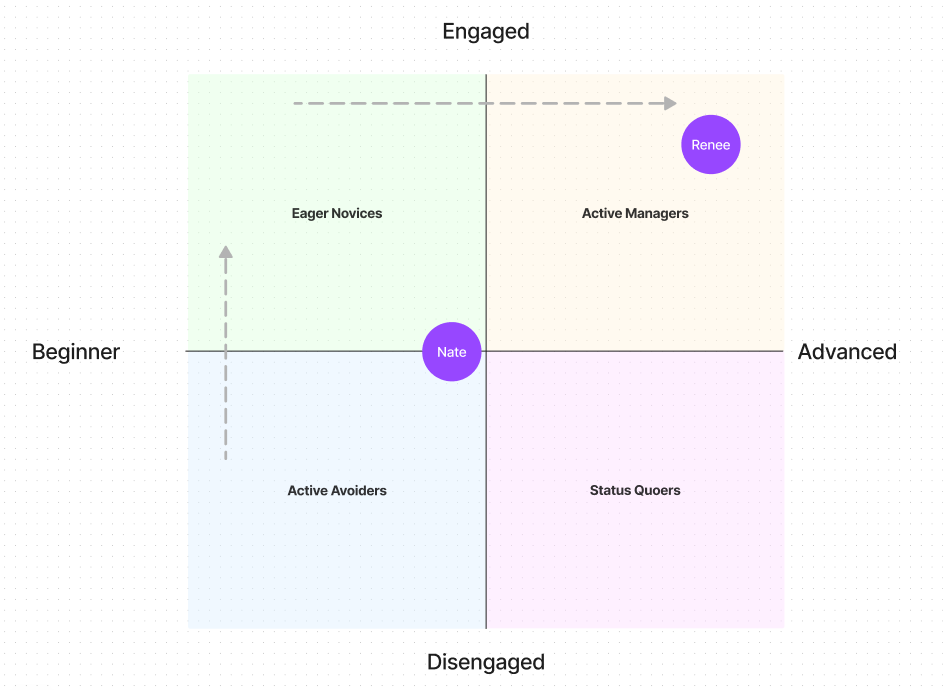
Doing this opened up all kinds of interesting conversations: now we could speak in high fidelity about how actual people we’ve spoken with fit inside these quadrants, and drastically increase the depth at which we could talk about these various types of users. Not to mention, it let us gut check this rubric, to see if there was any additional information we’d uncovered in our user research that might help better inform these categories, and the movement between them.
This new way of talking about our users has been immediately galvanizing. I hear phrases like “The Eager Novices will need…” and “To effectively help folks move from Active Avoider to Eager Novice, we could…”, which makes the design process much easier, and much more grounded in reality.